 In a recent post, Mike made reference to the beautiful artwork adorning the outside of North Coast Brewery’s, Brother Thelonious. I could not take my eyes off the label as I drove home from the market. It was intriguing to me as I considered that North Coast, in my opinion, never fails to deliver a great looking logo, regardless of the complexity or simplicity of the design.
Clearly, the aesthetic qualities of a bottle of beer (or the lack thereof) will not manipulate my taste buds into appreciating a particular beer more or less, but they may arrest my attention as I stroll down the beer aisle. If anything, they will leave me obliged to the brewer for putting heart and soul into every detail.
On the other hand, drinking a nasty beer out of a beautiful bottle irritates me. Besides feeling betrayed as my anticipation gives way to a sour face, the contents of the bottle should always supersede the clothing of the bottle (in my opinion).
Anyway, here is some ‘bottle art’ that I enjoy.
Anything by By Flying Dog Brewery:

The North Coast Brewing Company line up:

Nosferatu, Great Lakes Brewing Company:

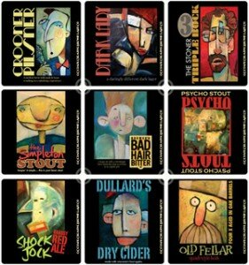
I stumbled across these labels, designed by Tim Nyberg, looking for a bottle to call home. I love the look and style of the artwork:

What brands/labels do you find attractive?
To what extent do think label art affects the sellability of the beer?


Flying dog art is done by the same guy who did the art for the Wall by Pink Floyd. That’s pretty cool.
[Reply]
I didn’t know that…no wonder their bottle art has the trippy psychedelic look to it.
[Reply]
I always thought Troegs and Magic Had had some pretty cool labels.
[Reply]
I would agree…both implement bright labels. So far I have been too impressed with the contents of Magic Hat though.
[Reply]